The CloudSponge Contact Picker is very versatile. Our customers have adapted the list of contacts for many different situations and requirements. Here’s how.
We support 3 types of customizations on the Select Contacts page:
- You can pick the columns that you want to display.
- You can set your own filtering criteria.
- You can receive the entire payload in a Javascript callback.
Columns
The default display of our contact picker is pretty simple. We display the Name and Email Address of each contact in the address book. When a contact has multiple email addresses, we show a drop-down list to let the user pick one of them.
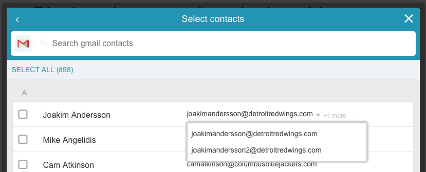
Some customers want us to pick a default email address for them so we provide an option to turn off the drop-down list when multiple email addresses are present.
When ignoreMultipleEmails is true, we’ll pick a single email to display. We try our best to pick a reasonable email address by looking at the meta-data in the address book.
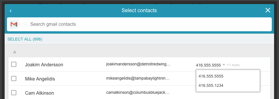
Some of our customers also want to display phone numbers for their users. So we let you add a third column to the list by adding the displayContactsColumns option.
cloudsponge.init({
    // add a third column to the display for phone numbers
    displayContactsColumns: ["email", "phone"]
});
The multi-select behaviour for phone numbers is the same as for email addresses and there is an ignoreMultiplePhones option that you can specify as well.
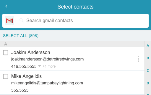
This also dramatically changes the behaviour of the contact picker on mobile devices. Since each row in the list now has more fields, we display a three dots icon on each row to take the user to a detailed view of the contact. In the detailed view they can pick the email and phone number using the native UI if multiples are present.
Filtering
True to our email-centric defaults, we won’t show any contacts that that don’t have at least one email address. But you aren’t stuck with this behaviour. We expose the Javascript filter function as an option so you can write your own based on any criteria you want.
A typical case is when you want to include the phone number column in the contact picker. You probably want to include contacts that have either an email address or a phone number in the address book list. This is a great reason to specify a custom filter like the one below as part of our initialization options:
cloudsponge.init({
    // ...
    filter: function(contact) {
        // return a truthy value to include this contact in the display
        return contact.phone.length || contact.email.length;
    }
});
If you are not comfortable writing Javascript, let us know. We can create a simple filter for you and associate it with your key.
Callbacks
Finally, if you still want something that we don’t support with our simple options, you can have the entire address book and display it however you want. Our beforeDisplayContacts callback will pass you an unfiltered address book that you can use to render your own list.
We have seen customers post the address book to their server and let it render the HTML or others will use a templating framework to build the address book display in the client.
This is definitely a more advanced approach and it gives you complete freedom in how you make the address book look to your user.
As with any technical challenge, there are several possible paths to success when it comes to the layout of your address books. If you are unclear or debating which approach to take, reach out and tell us what you are trying to achieve. We can advise you on the shortest path to success.