…or should we call them “Analytics”?
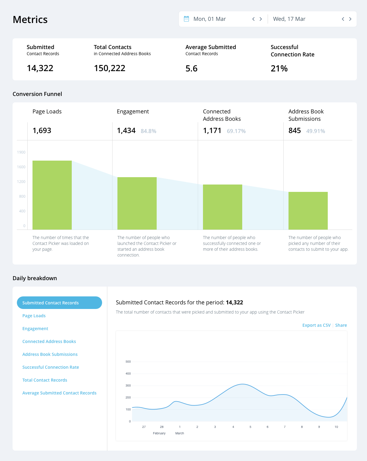
Take a look at this early mock-up of some new charts that are coming soon to your CloudSponge dashboard:

We’d love to get your reaction to this so we can incorporate your feedback while we’re still working it out.
Love it? Hate it? Would you use it? What kinds of questions would you try to answer with it?
Please write us an email or join the conversation in Slack if you can help!
