E-Commerce is a massive industry, and there are more than enough opportunities for you to make your business a success. Of course, that also means that there is plenty of competition. According to statistics, there are roughly between 12 and 24 million online stores, and the number is constantly growing. More specifically, E-Commerce is predicted to account for more than $6.5 trillion in sales by 2023, which makes up for 22% of all retail sales on a global level.
However, in order to convert your online store visitors into customers, you need to give them multiple reasons for it, other than a great product. One of the most common reasons why potential shoppers are leaving your online store (and hurting your conversion rate in the process) is the design of the website itself. For example, 48% of users view website design as the #1 factor when judging a business’s credibility.
With that in mind, let’s take a look at six of the most common mistakes in the design and functionality of your website that are killing your conversions. We’ll also talk about how you can fix these mistakes, or if you are new to the industry, avoid them altogether.
Don't miss out on additional paying customers coming your way!
Audit Your Website's Sharing Features Now!
1. Confusing Navigation
You only have a handful of seconds to capture your visitors’ attention, and once you do, you need to make their experience on the website as streamlined as possible. This also includes navigation throughout your e-commerce store. If visitors are unable to find the product they want to purchase or they have to click through multiple screens in order to access it, they will most likely get frustrated and turn away. When you have only one or just a handful of products in your online store, navigation should be as simple as possible.
For example, Kopi Luwak Direct opted for the simple and direct approach to navigation. Sure, it features a navigation bar at the top of the page, but if you are looking to buy Kopi Luwak coffee, you can do so right away from their homepage by clicking the “Shop Now” button. And it only takes a single click to learn more about the company or to access one of their brewing guides.

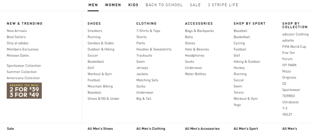
Of course, things get a bit more complex when you have a lot of different products across multiple categories. But even then, you can still make it easy for your customers to find their way around your store. Adidas did a really great job with their website, even though they sell just about everything when it comes to sports gear, apparel, and accessories. All you need to do is hover your mouse over any of the categories listed on the navigation bar, and from there, you are able to access their product by type, gender, sport, collection, and new or best-selling items.
2. Unclear Shipping Details
Pretty much every customer likes nothing better than free shipping, but even if you are not able to offer that, you can still make a sale by being upfront about it. One of the most common culprits behind shopping cart abandonment is all the extra costs, such as shipping, taxes, or any other type of additional fee, mainly because the customers aren’t made aware of them until the very end of the checkout process. In fact, 49% of shoppers abandon their shopping carts because of this very reason.
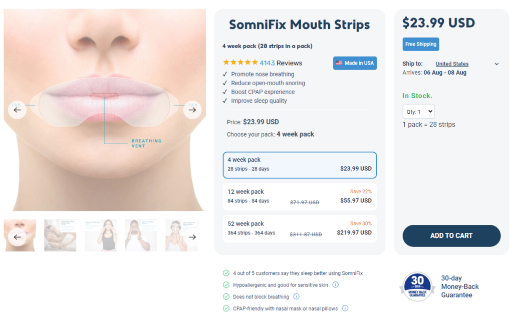
One of the best examples of clear communication about shipping costs is Somnifix, which ships its mouth strips for free in the US, as well as in some EU countries. In case they don’t provide free shipping to a particular location, which you can select from the drop-down list, you can still view shipping costs and when the item you want to order will be at your doorstep.
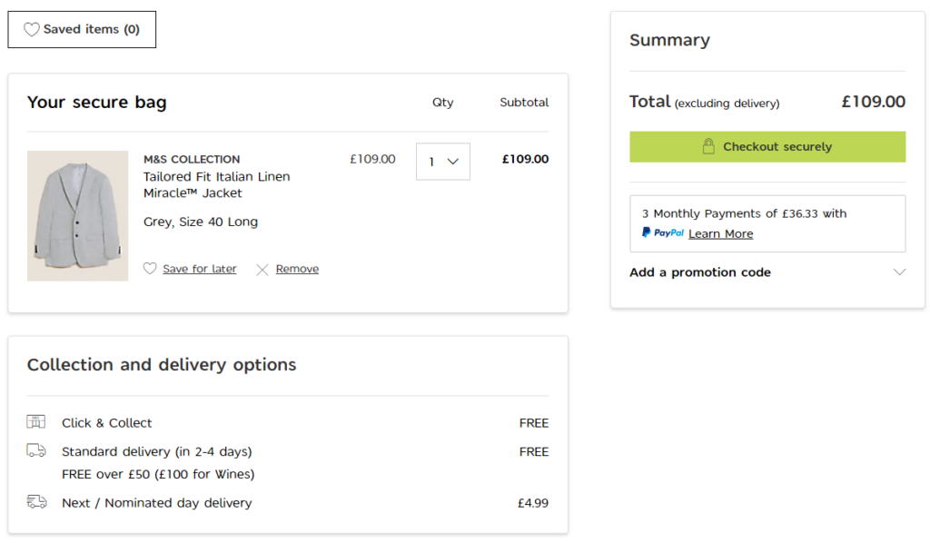
One of the UK’s biggest retailers, Marks & Spencer, goes into great detail to make it easy for shoppers to consider all of the shipping options. For every item chosen by the customer, the page will show the price for regular shipping, which is free for all purchases over £50, as well as for next-day delivery, which obviously costs extra. Because they have physical stores, they also offer the Click & Collect option for those who prefer to personally pick up the items they have bought.
3. Using Mailto Links Instead Of A Contact Picker
Last but not least, e-commerce websites often neglect the sharing process and experience of their customers when making a referral and end up inserting a social media or email Mailto link to drive more business. This demands your customers to either input a list of email addresses, separated by a comma or redirect to an external pop-up window to send out a referral using their preferred email service provider. Sharing on social media fails because instant messaging is not exactly an ideal place to archive recommendations made by friends to revisit and purchase from later, and sharing using a Mailto link is a wasted opportunity to track, retarget and convert your potential customers.

Thankfully – the solution is simple: Use an ‘Add from Address Book’ option instead of a ‘Mailto’ button – letting your users easily select contacts off their preferred email address books to make a referral – no nasty redirects, no need for memory recall, no tab switching, no typos, and multiple referrals in just a handful of button clicks. It can even be set up to extrapolate recipient details to personalize your referral emails to give you better email open rates and faster conversions of new referrals.
It makes the whole sharing process extremely efficient and non-time consuming for customers, and more profitable for your business.
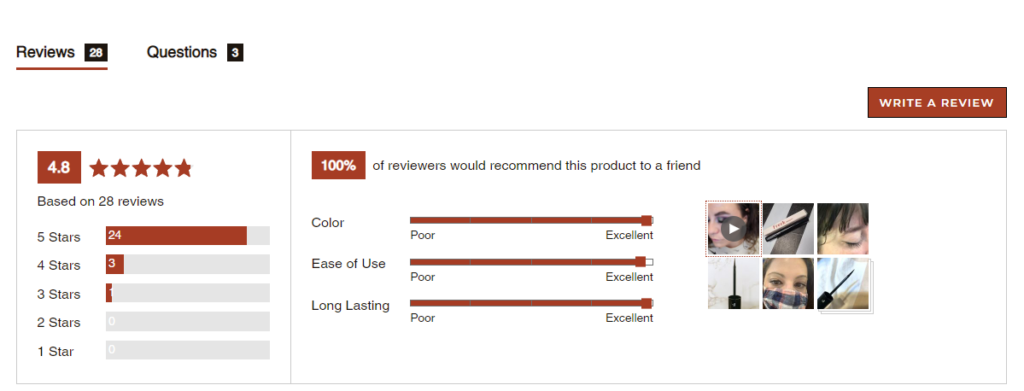
4. Not Maximizing the Value of User Reviews
Once you have social proof, you should make the most of it by combining user reviews with UGC (User-Generated Content), which will add an additional layer of credibility to your brand. This goes double in the case of reviews that contain images of your product captured by the customer while they are using it in real life. Allowing your customers to upload images not only helps with credibility but also makes your business look open and transparent. Some products simply need to be seen within a certain context in order for potential customers to see what they are really like.
For example, Sola Wood Flowers has an incredibly detailed review section in which UGC is king. This approach is extremely helpful for the customer because they can see what the flower bouquets look like after they are unpacked and arranged in the happy customers’ homes. People tend to be quite discerning when buying decorative items for their homes, and this sort of authentic content and social proof can work wonders in getting them to convert.

But, UGC and reviews also work for smaller and more affordable items, such as makeup, beauty products, or apparel, where it’s equally important to see what the product looks like on an actual person. This is another reason why UGC is so effective, as it can communicate important information not just about the product but about the reviewer as well.
One brand that does this exceptionally well is Freck Beauty. The website features UGC that revolves around their beauty products and makeup, with images and videos showing how the product looks when applied to a particular skin tone or how it works with different eye colors.
5. Complex Checkout Process
Another major reason why shoppers might be leaving your online store and their shopping carts is because of the checkout process. Perhaps it is too lengthy so they get frustrated, or they are not allowed to make purchases using a guest account.
In fact, 35% of shoppers have stated that they have abandoned a shopping cart because the guest checkout option wasn’t available. Also, they might not be willing to give up their personal information if they don’t trust your brand just yet.
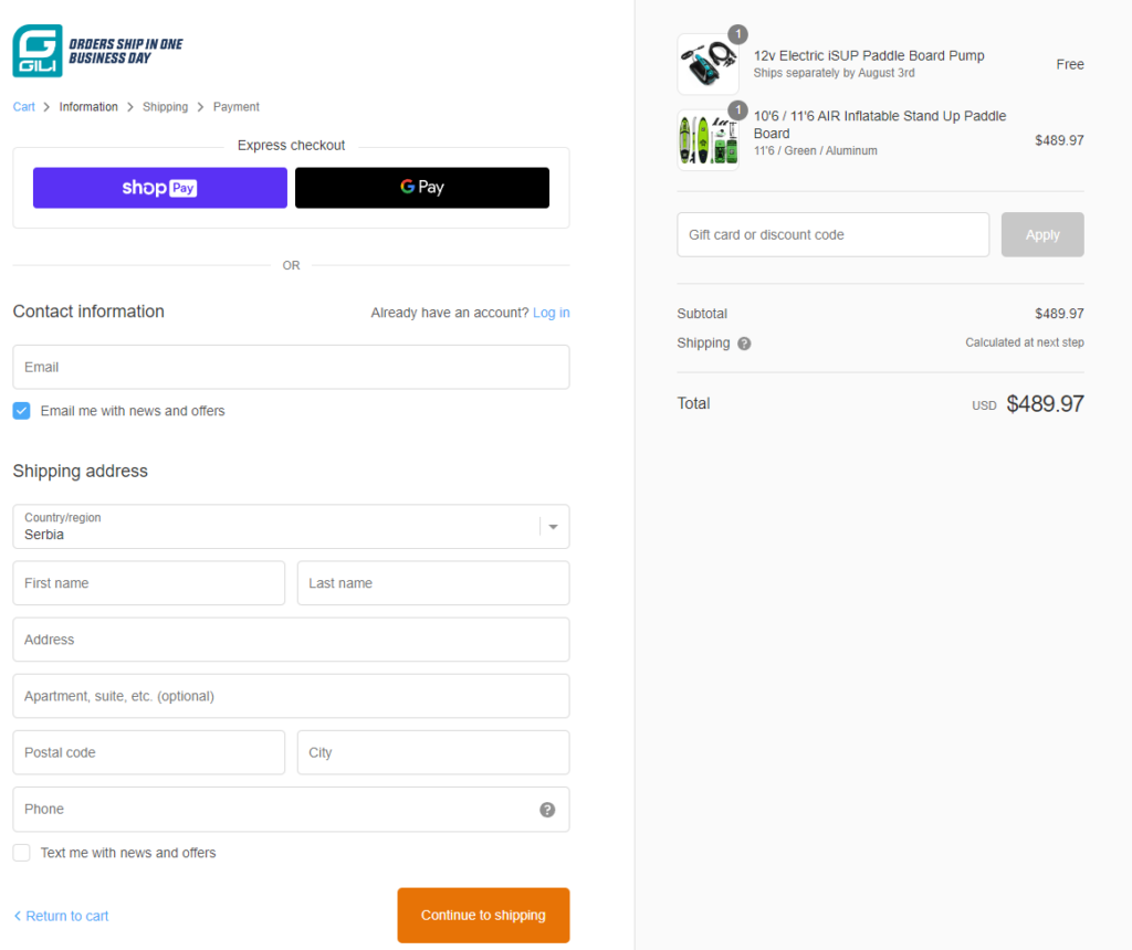
This isn’t the case with Gili Sports, which enables customers to purchase their products not just via guest checkout but also with their Express checkout option, in case the shopper is using Google Pay or Shop Pay. Plus, they don’t hassle users with multiple checkout screens, so the entire process is very fast and streamlined.
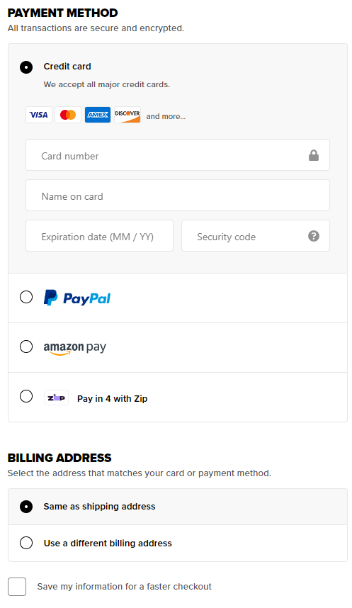
Another good example of how you can make the checkout simpler is Fashion Nova, which is one of the biggest clothing stores in the US. They also offer a variety of Express checkout options, including Google Pay, Amazon Pay, PayPal, and Shop Pay. In addition to that, they make the checkout process easier for you in the future, even if you still don’t want to create an account, by offering “Save my information for a faster checkout.” This spares you the trouble of having to enter your information the next time around, which is very convenient and user-friendly.
6. Not Optimizing Your Site For Speed
One huge mistake a lot of e-commerce businesses make is to have a website that looks great but is very slow to load. According to statistics, a business loses around 25% of its online visitors if its website takes more than four seconds to load. Also, Walmart found that its conversion rate improved by 2% for every 1-second improvement in page load time.
Unfortunately, today’s shoppers are very impatient, and that one extra second your website takes to load can mean the difference between them converting and leaving to check out one of your competitors.
Poor page speed doesn’t just affect your conversion rate but also your website’s UX, bounce rate, and ranking. Now, there are many different factors that can affect page speed, so you may want to do a thorough check of all the elements that have anything to do with the performance of your website. Some of the most common culprits that make your website slow and which you should look into are:
- High-resolution images – There are plenty of tools out there with which you can compress your images and not lose much in terms of quality while reducing file sizes.
- No browser caching – If you enable this, copies of your website’s files will be saved, which allows the server to generate your website much faster.
- High number of redirects – By reducing the number of redirects, HTTP requests will be shorter, resulting in a faster page load time.
- Not using a CDN – If you decide to use a CDN, your website will be hosted and delivered from a server that is nearest to you geographically.
- Too many plugins – Only use plugins your website really needs and update them on a regular basis.
7. Limiting Social Proof to Product Pages Only
Nothing spells credibility like social proof, but it’s not just a matter of enabling your customers to leave reviews on your website. Yes, they should be able to leave reviews, but most e-commerce stores make the mistake of limiting user reviews to just their product pages.
The truth is, a lot of shoppers don’t even make it all the way to your product page while browsing for items. Even when you yourself are browsing on Amazon, you will probably focus on the search results that have a five-star rating displayed prominently under their name.
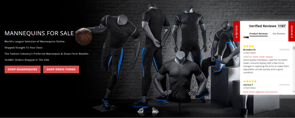
The solution would be to offer social proof much earlier in the process, perhaps even on your homepage. Mannequin Mall, for example, features a “Review” flyout on their homepage, which enables customers to check out user reviews right away. This will provide them with instant social proof that shows your business as credible and trustworthy, making them more likely to convert. Also, if you scroll down their homepage, they also single out some of their products, along with their respective ratings and links to reviews.
Wrap Up
While having a beautifully designed website is important, its functionality should never suffer because of aesthetics. Hopefully, with all the helpful tips shared in this article, you won’t have to choose between the two – plus, you will avoid some of the most common mistakes most e-commerce business owners make. Good luck!
Excited to get started?
Download our Better Sharing Workbook Now
(it's quick, easy and absolutely free!)