Every once in a while we come across a referral program implementation that just rocks. It’s well thought out, looks good, functions well, and overall becomes a pretty nifty experience for the end-user/customer. ‘Wise’ (formerly ‘TransferWise’) is one of them.
An intuitive peer-to-peer money transfer application that offers the best conversion rates for overseas transfers and prides itself over its aggressively low transfer fees. I happened to use the service recently and noticed their ‘Invite & Earn’ referral program. And well to say the least it’s very, very interesting.
In this teardown, I’m going to take you through the complete sharing experience as a Wise user. I am making notes about this as I discover it myself firsthand – so this review is purely my first-hand experience and thoughts while making a referral as a customer.
We will look at everything from sending the referral out to receiving one. There’s a lot to check out and like here. In fact, I would say it’s probably among the better interfaces I’ve seen in a long time. But is it the best? And can it be improved? Read on to find out.
Want to improve your referral program interface? We can help! Download the Better Sharing Workbook now!
The Sharing Program
So the referral program itself is quite traditional in the sense that you invite a couple of friends, they make a discounted purchase and you earn a reward for bringing in a paying customer. Both sides benefit from one another.

In the case of Wise – You enable free transfers of up to $600 to your recommended friends and if any 3 of them make a transfer of $300 or more – you get to make $115.
The whole program and benefits are explained using a carousel of clean and modern vectors. I think a carousel was a conscious choice as the complete website seems to be a mobile-first design. Essentially prioritizing mobile users over desktop. This can be largely due to the fact that P2P transfers are usually made using mobile devices and the whole interface is geared to cater to that.
The Sharing Interface
So this is actually quite interesting – the complete referral process is packed into this one referral link which is available right on-screen from the very start (as opposed to behind an additional button that reveals it). And should you choose to, you can just copy it and move on. This leaves a lot of agency with the referrer and that’s good UI.
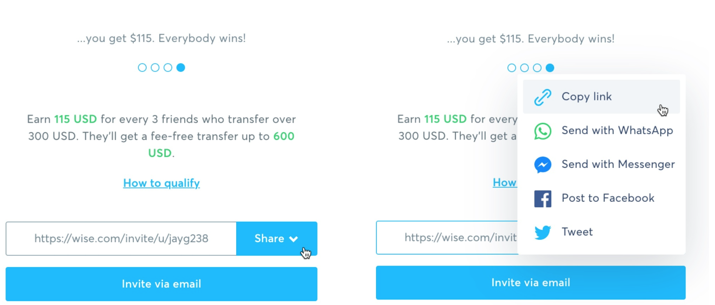
Another thing to note is how Wise separates the ‘Invite via Email’ option from its Socials while still keeping it all on one page. All social media links are nicely tucked away under one control center called ‘Share’.
The custom link is personalized to the sender and basically opens a sign-up landing page with dynamic fields that incorporate the name of the sender into the message heading.
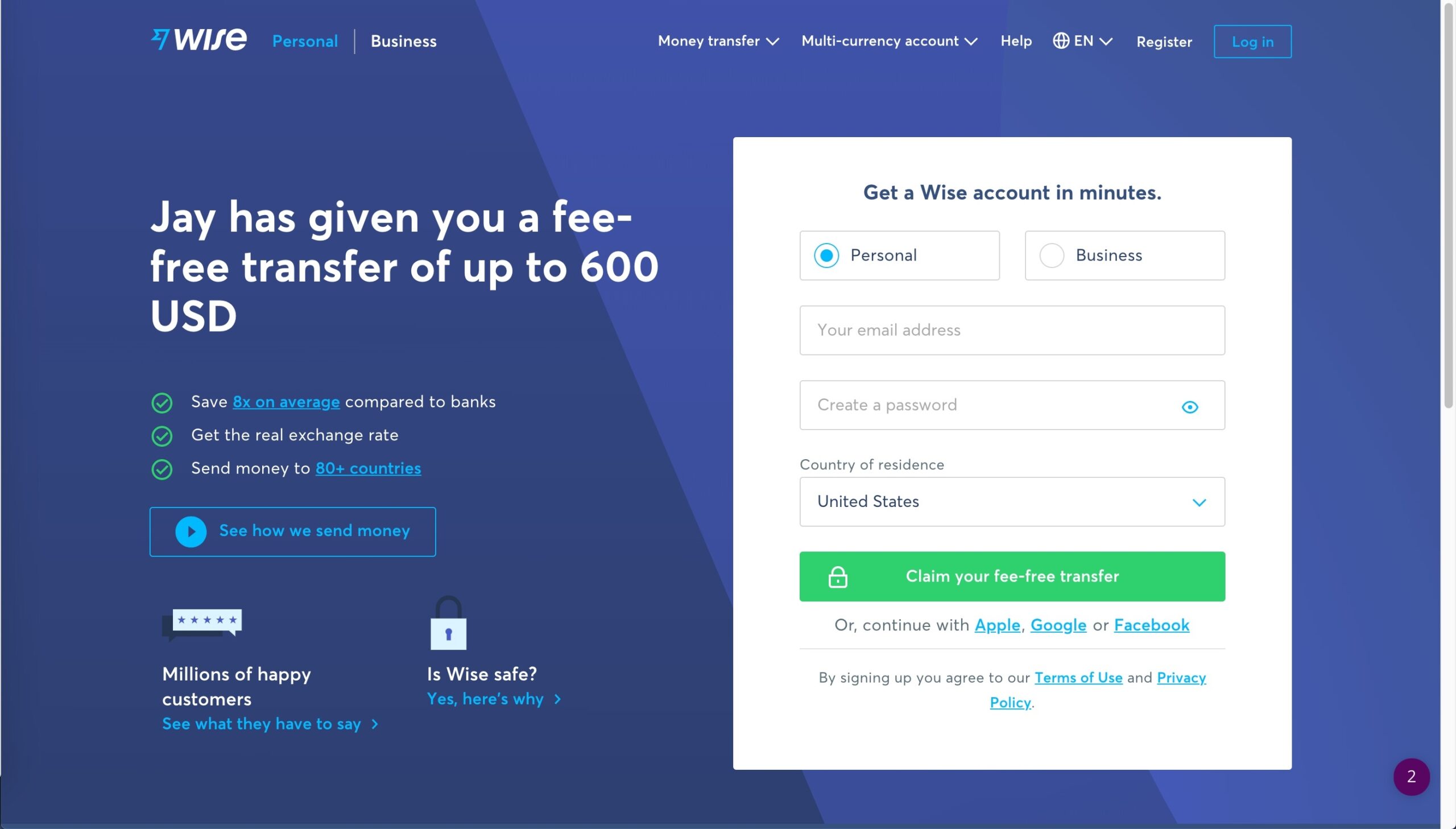
I really like it. It’s nice and slick. Personalized, which is an important factor to any good word-of-mouth marketing. It got its 3 top benefits right there with an explainer video hyperlinked and a CTA. It’s well designed, useful, and efficient. I really like it.
The Sharing Process
Invite via Social Media
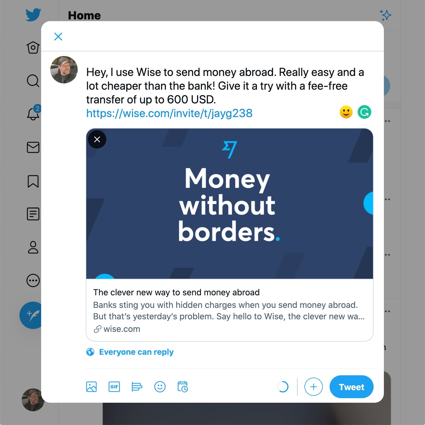
Twitter: This launches into a new tiny browser window with a preloaded tweet, which is pretty good. You can edit your tweet to match your style and just go with what’s available. It’s still redirecting them to your personalized referral link with a sign-up form (seen above) but casually includes the benefits into the preloaded message.
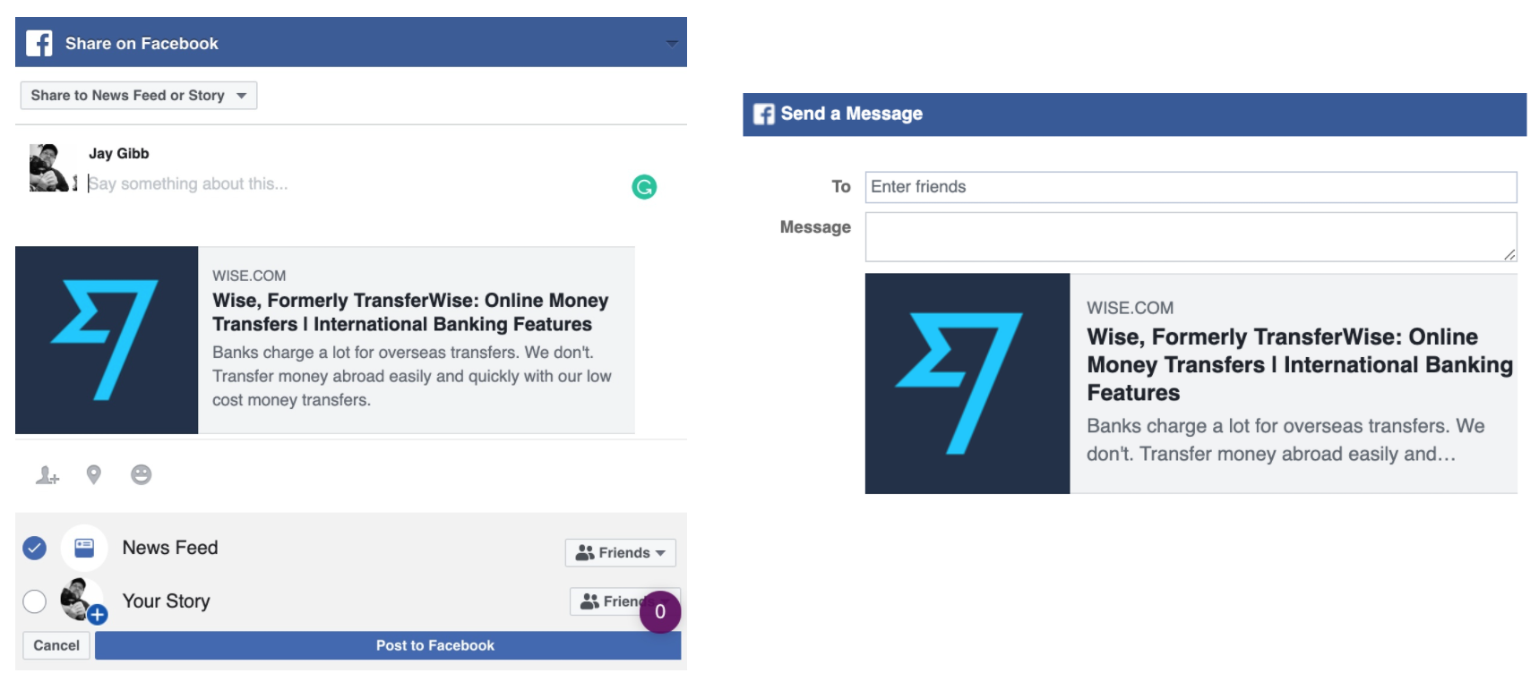
Facebook: You have a total of 3 ways to share over Facebook – On your ‘Newsfeed’, as a ‘Story’ or as a private message via Facebook’s ‘Messenger’. Messenger is actually available as a standalone option for quick access while the other two are clubbed under ‘Facebook’. Preloading messages onto Facebook is not an option so it makes sense to just use the referral link here along with your own customized message.
What’s interesting is that while the whole interface is a mobile-first design – It’s implemented intuitively to identify what device you’re using and accordingly launch either the browser (on desktops) or the installed app, when available.
WhatsApp: Using the same implementation it did with Facebook and Messenger. Clicking on WhatsApp also launches the browser window or app basis of the device you’re currently using. In fact, the implementation here is so on-point that it goes a step ahead by also cross-checking if you have the desktop app installed – to offer you the choice to launch it as you prefer.
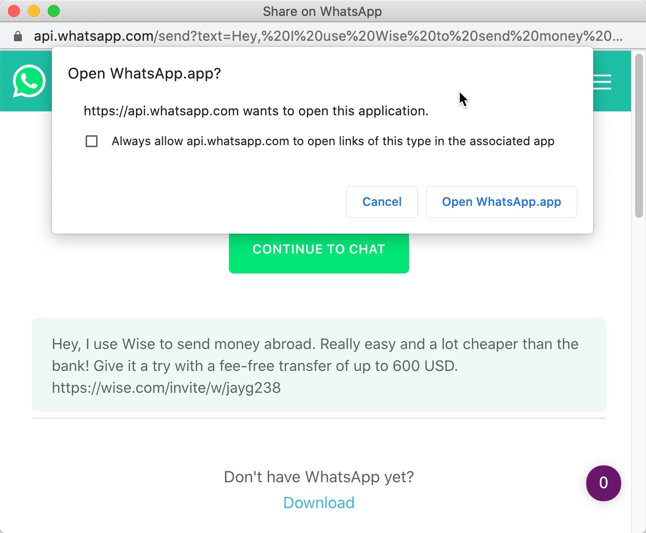
This might also be an integration that works with the native WhatsApp desktop API. But it’s cool to see it incorporated nonetheless. WhatsApp also allows preloaded messages and Wise makes efficient use of it by packing in a nifty message along with the referral link. There’s no way to edit this message though as it goes through as soon as you choose the contacts you want to send it to.
Invite Via Email
Stepping back from the main share control button brings us back to the very alternative – sharing via email. I can tell I already like it because they seem to be using CloudSponge. 😎
This is a nice moment – because up until this point in checking out the referral interface – I wasn’t aware that they were actually one of our customers. That’s good to know and makes me happy.
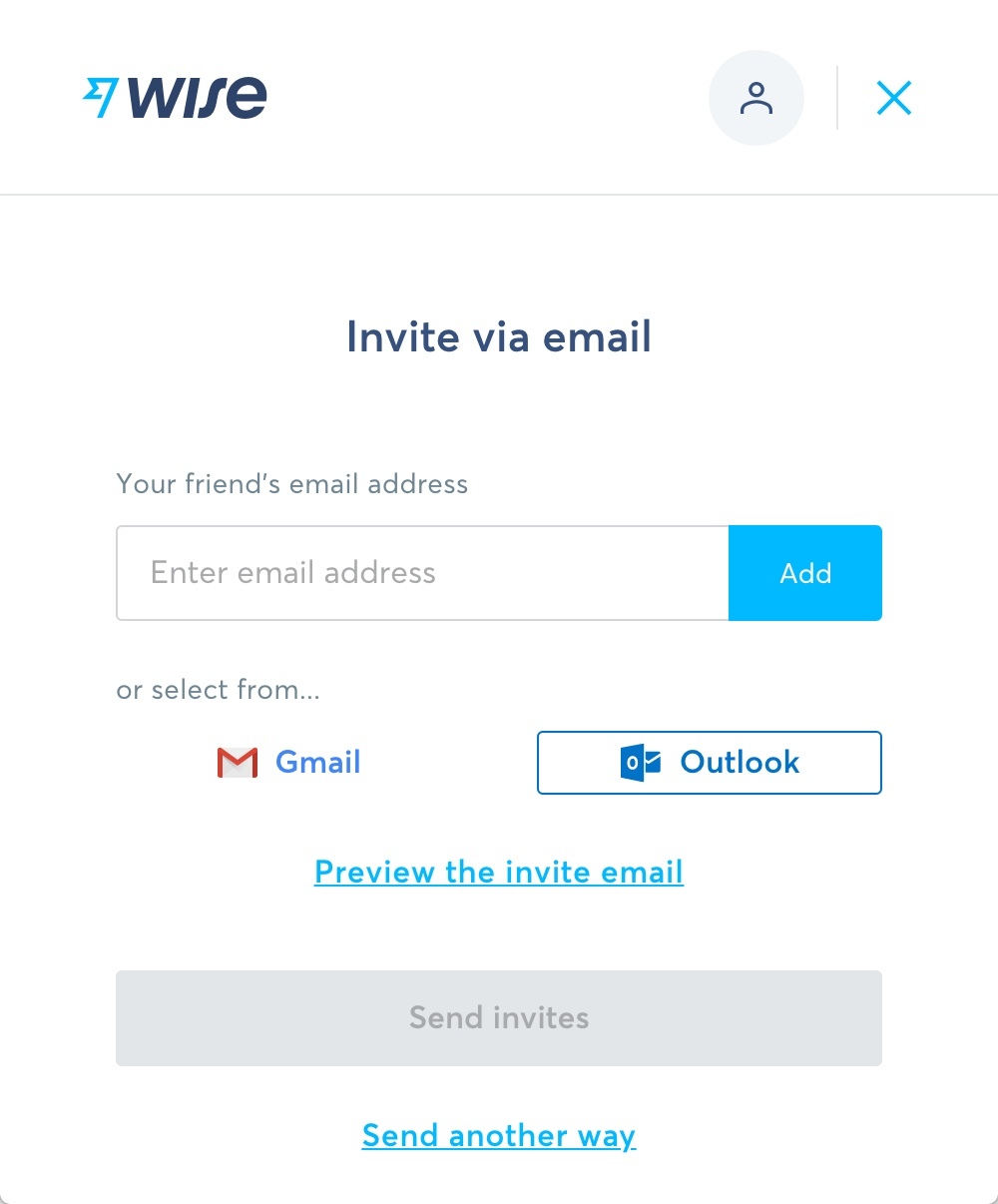 So diving right in – They’ve got the ‘Add friend’s email address’ field right at the top if you are the 1% of people on the internet that remembers and likes to type out email ids from memory.
Then they’ve got the CloudSponge address book buttons mapped to Gmail and Outlook, which is pretty straightforward. I can tell they used the deep-link integration we offer so there’s no CloudSponge menu or branding. This is a good sign and it tells me that Wise takes its brand and referral program pretty seriously. That’s really good.
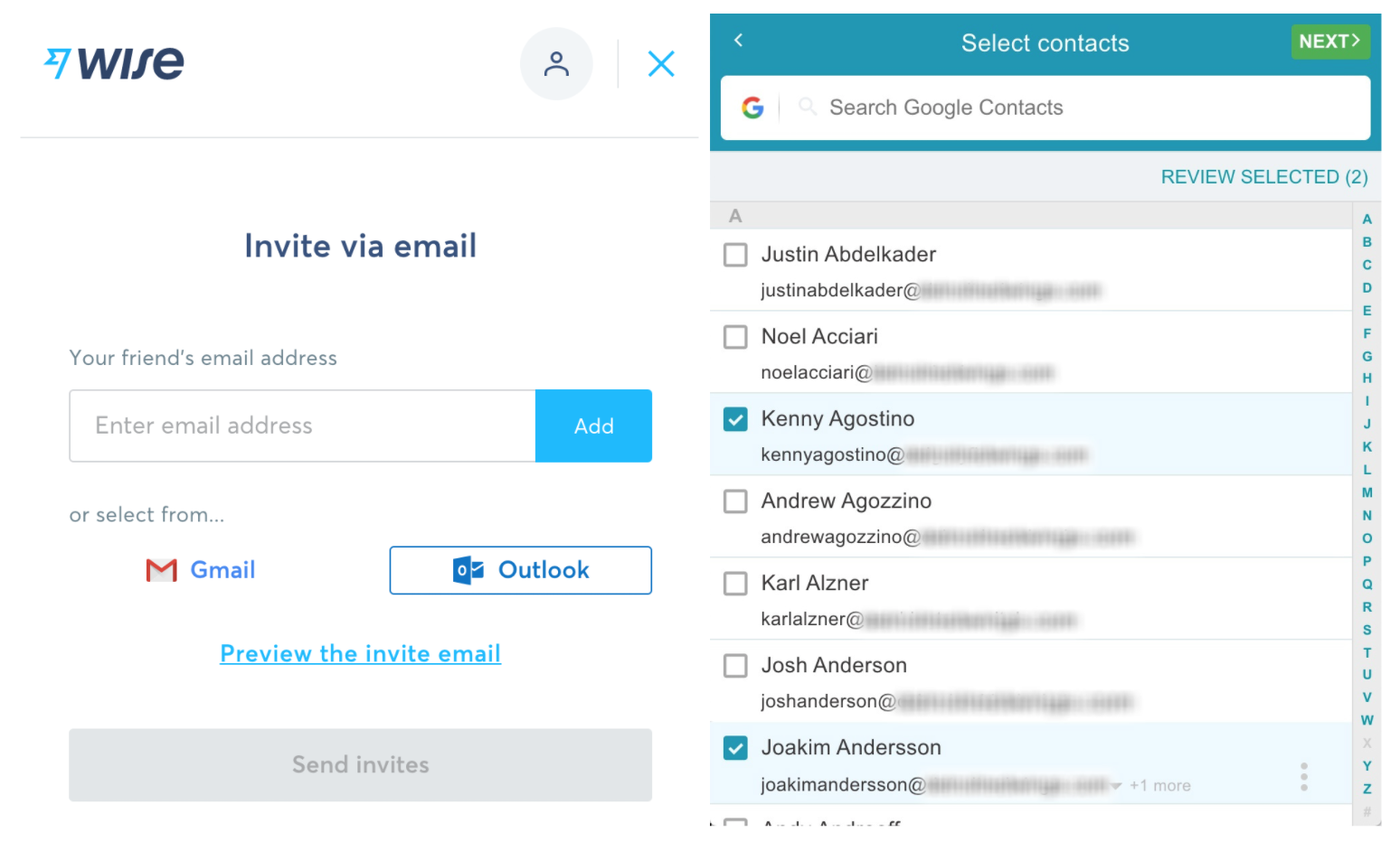
Clicking on either of these address book buttons takes you directly into the CloudSponge Contact Picker menu. From there it’s as simple as selecting your friends to add their email id.
The contact picker then automatically picks up the “First” and “Last” names of each of your friends to personalize the referral email. It really does not get more intuitive than this when it comes to making referrals using email.
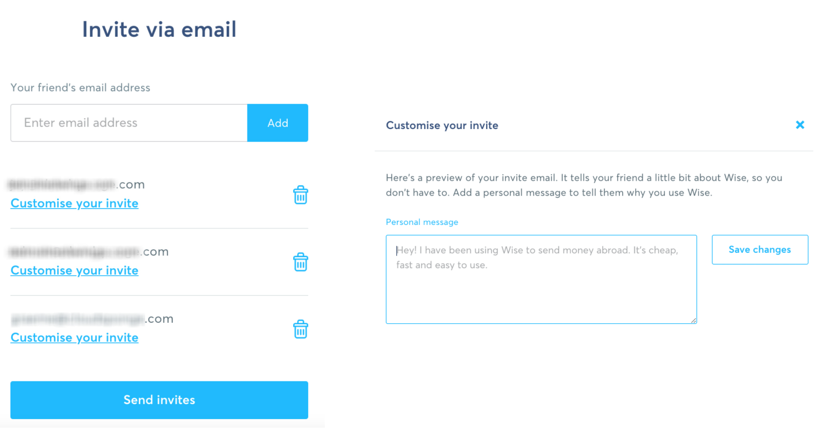
Once you’re done selecting your contacts – they are populated in a clean list with options to customize the default message for each recipient. The interface is so slick that it recognizes when I have chosen to do so and changes the ‘Customize’ button into an ‘Edit’ button once I’m done. It’s little touches like these that really add to the whole experience.
It also gives you a nice preview of your email layout and design so you exactly know what your recipient gets to see. They also grab your initials to tie in with the cute-sy chat bubble. Wow. Isn’t that nice? That’s beautiful.
And that’s the end of the referral process for the Wise customer. And I gotta admit, I am extremely impressed with it so far.
Let’s hop on the other side and see how it all works out for the recipient.
The Referral Email
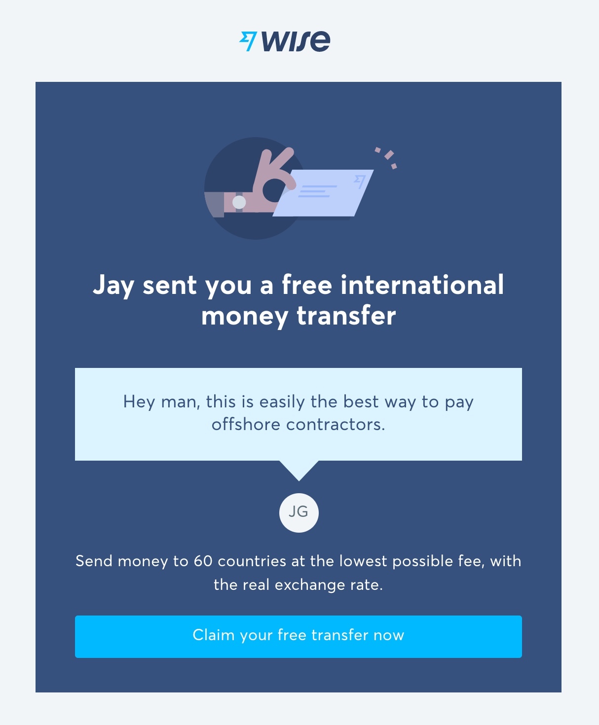
Alright, the very first thing to notice here is that the email comes from Wise and also includes Wise as the sender’s name in the ‘From’ field of the email dashboard. This is not only a lost opportunity to further personalize the experience on the receiver’s end but also tends to get filed under the ‘Updates’ tab on Gmail. It’s likely that this would drop under the ‘Primary’ tab had it included the actual name of the referrer instead of ‘Wise’.

Subject Line: I immediately have the same observation on the subject line here. Instead of using “I’ve sent you a $600 USD fee-free transfer” – It could maybe, have been something that utilized the power of the implemented contact picker, to use the first name of both, the sender and receiver. You know something on the lines of “Rehaan, you’ve just been given $600 fee-free transfer from Jay” – instead of using “I’ve” or skipping the recipient’s name altogether.
So I don’t love that. It’s a missed opportunity.
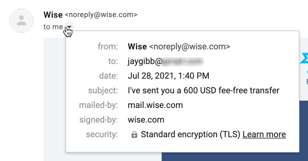
‘From’: As discussed earlier – The inclusion of the sender’s name in the “From” field can get way better open rates. It’s a fact. People respond or engage better with promotional emails when it comes from someone they know. It’s repeatedly worked for our customers. And again – it just feels like a missed opportunity especially when you know the possibility and functionality that exists with the Contact Picker. This could have easily been “Jay Gibb via Wise”, instead of just using “Wise”.
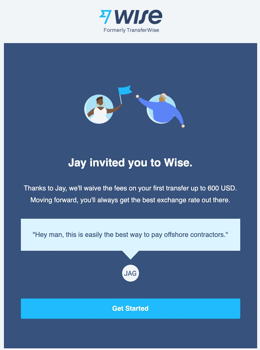
Email Body: As expected – the final email template is almost identical to the preview we saw as the sender earlier. And as you can see, there’s a lot of dynamic fields in here to personalize the whole experience. They use my name in the header, the body, and then again my complete initials. They just seem to have made a conscious decision to not include it in the subject line and I wonder why. In fact, even here (like the subject line) – instead of using all dynamic fields to input the sender’s name into the email body – they could have switched it up by incorporating the recipient’s name as well.
Like instead of saying “Jay invited you to Wise” in the header and immediately following it up with “Thanks to Jay” – which is a repetition of the same information in a way. They could have maybe used the recipient’s name in the header. Like “Nader, you’ve been invited to use Wise” and then followed it up with the sender’s name in the email copy and initials as they have.
I also really like that they chose to say “We’ll waive the fees in your first transfer” instead of sticking with “Fee-Free”. While I understand the marketing appeal of the latter, it’s just an awkward-sounding combination of words.
The Sharing Experience
Alright, and there you have it. The complete sharing experience of referring your friends to Wise. Like I said earlier – there’s a ton here to like and take inspiration from. The interface is clean, the UI is slick, the design, tone, branding, and copy are all well tied together and offer a cohesive fulfilling experience to the end-user. To quickly recap – here’s a list of things we loved and some notes on what can be improved.
What’s Good?
- The user interface is very clean and modern, which we find is inviting for its users.
- The referral link is up for grabs from the get-go. And the redirected lander is personalized, focussed, and efficient for its purpose.
- The referral system is robust with social sharing buttons nicely tucked under a single encompassing menu.
- Twitter and WhatsApp are not only preloaded with referral messages but also intuitively open either in a browser window or the app, depending on the device you’re using. Facebook and Messenger behave the same albeit without preloaded messages.
- It uses a Contact Picker for the purpose of sending referrals via email, which is hands-down the most efficient and intuitive method to input email addresses into an address field. Not to forget it also results in nearly 4 times the average referrals made per customer.
- There’s a lot of attention given to personalizing the referral email. This is great for the user experience on both ends of the referral system.
- You also get to preview a near-identical version of the email you’re about to send out. A great deal of emphasis is placed on the look and feel of the referral interface, landing page, and email. Which is great and ties into the brand’s identity beyond the website.
What Can Be Improved?
- They should have used the Contact Picker’s full potential to incorporate the sender’s name into the “From” field of the email. “Sender’s name via Wise” is infinitely times better for good open rates than without.
- Making it even better would be using the recipient’s name as well in the “Subject line” of the email. This reads to the recipient that the email is specifically meant for them and thus they should take notice.
- Finally, we noticed that once you have chosen your contacts using the contact picker and populated a list of invites – there is no option to add more contacts without restarting the process, should you choose to. This in no way breaks the system and is probably a nitpick at best – but it’s always good practice to never block out a customer that wants to make more referrals to your business. The easier it is – the better it gets.
Inspired to improve your referral interface?
Download the Better Sharing Workbook Now
(it's quick, easy and absolutely free!)