Website performance has a tremendous impact on the success of your business. More so if your goals include capturing leads, converting customers, boosting retention, or getting the most out of your marketing campaigns.
But what do UX and UI have to do with these goals?
Research suggests that they play a crucial role in boosting critical e-commerce metrics. For example, Adobe’s State of Content report revealed that:
- 65% of users think it’s essential for content to display well on their devices.
- 64% want to interact with pages that hold their attention.
- 54% of people care about pages looking good. And,
- 49% want more personalized experiences.
Give web visitors all of these, and you’ll see great results. But if you fail to do so, the most likely outcome is that 89% of people will stop interacting with your content altogether.
In other words, if you want to boost critical metrics on your e-commerce store, you must pay close attention to your site’s UX and UI design. The following tips are guaranteed to help you do just that. So, without further ado, let’s get into the top design strategies that can boost e-commerce metrics and drive your business’ success.
Double the performance of your referral programs in 3 easy steps Download our DIY Workbook today
1. Sales Conversion Rate
The median conversion rate for e-commerce in 2021 was just 5.2%, which is, technically, enough to guarantee business survival.
But consider that 69.99% of people abandon their carts without making a purchase (usually due to concerns like shipping costs, returns processes, and after-sales support). With this in mind, it becomes evident there’s something about most e-commerce website UIs that’s simply not cutting it.
So, what UI design hack could you employ to boost e-commerce conversion rates? Well, the answer is relatively simple. All you have to do is clearly address your target audience’s conversion obstacles.
By addressing your prospects’ concerns, you’re not just showing that you understand their pain points and frustrations. More importantly, you also show that your brand has what it takes to solve these issues with competence and reliability and that your business aims to be 100% user-oriented, no matter what it takes.
For a great example of how you can use UI elements to solve this conversion obstacle, check out what Dress Forms USA does on their product pages.
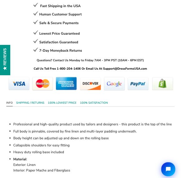
This brand employs an attention-grabbing UI design element that addresses user concerns and builds trust (consequently boosting conversion rates) by describing what the business can do to help prospects feel more confident in their buying decision.
The checked trust badge style promises sought-after product benefits, listing payment options quells shop safety concerns, and the tabbed content section provides all the necessary information buyers want to obtain when deciding whether to purchase.
2. Average Order Value
The purpose of an e-commerce website is to generate revenue and allow you to make a profit. But, if you want that profit to be enough to sustain your business over time, you’ll have to either make more sales or increase the average order value in your store.
And how does boosting AOV help your business? Well, it’s relatively simple.
Every single sale comes with operational costs (freight prices are still 400% of what they were pre-pandemic). So, it’s clear to see that selling to one customer makes for a more cost-effective way to generate revenue than paying for the shipping, handling, and packing of multiple different orders.
And fortunately, there is a UI design solution that could help you increase AOV in your e-commerce store: enabling logical cross-selling features.
For example, if you look at the Ugmonk Analog Starter Kit product page, you’ll notice that two prominent UI elements allow the brand to boost AOV.
The first is an upselling element that encourages buyers to buy a subscription to the brand’s paper cards. The other is a cross-selling element that recommends a relevant product. The recommended felt travel case can elevate the customer experience and allow buyers to get more value out of their purchase.
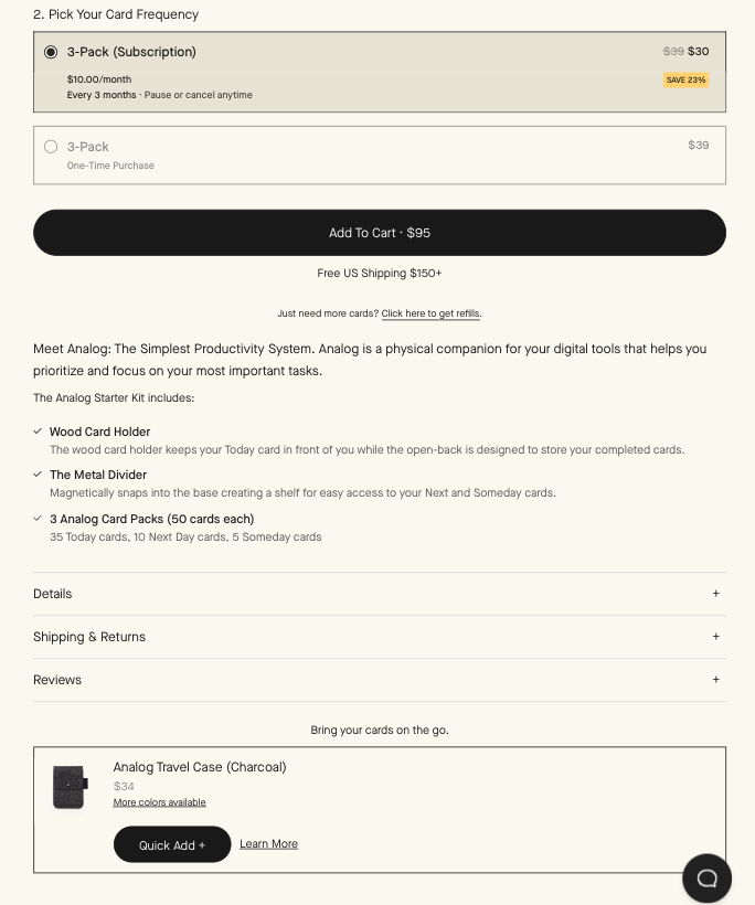
Now, if you decide to employ this type of UI element in your e-commerce store, you must remember that cross-selling and upselling work best when it’s logical and seems natural.
After all, encouraging a customer to add an irrelevant product to their order isn’t just going to make them think there’s something shady going on on your site. Even more likely, it’ll give off the impression that you either do not understand the elements of a good customer experience or, worse yet, don’t care about it.
3. Number of Email Subscribers
As an e-commerce business owner, you may not pay much attention to your newsletter subscription metrics. After all, email is an outdated communication channel that belongs in the mid-90s, right? Well, if that’s what you think, then we must tell you that you are wrong.
Email is a precious marketing method that lets you achieve excellent results at a relatively low cost. Moreover, it can also:
- Help you increase brand awareness
- Allow you to expose your customers to your products (thus boosting their chances of wanting to buy them)
- Give you the opportunity to maintain contact with your customers to increase loyalty and Customer Lifetime Value
In other words, the more email subscribers you capture, the higher your e-commerce store’s chances of converting customers.
And the great thing is that you can boost email subscriptions by optimizing some of your website’s UI elements and making newsletter subscriptions attractive and easy.
For one, by ensuring that your CTA buttons are well-designed and prominently displayed, you can guarantee that they grab your prospects’ attention. Secondly, by making small changes to the CTA button copy (like giving better incentives for signing up), you can further boost email subscriptions, then nurture your newly acquired prospects into loyal customers.
Nonetheless, if you want to guarantee that your e-commerce website inspires newsletter subscriptions, you will want to create UI elements that go beyond the basics of CTA button optimization.
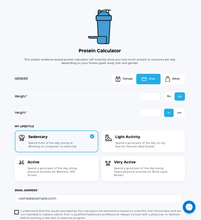
For inspiration, look up to Transparent Labs, which created an interactive UI element in the form of a protein calculator. The calculator is essentially a lead-generation tool that allows users to get personalized responses to their questions.
What makes this solution such a great way to encourage newsletter subscriptions is its beautiful design, easy-to-use functionality, and, most importantly, the fact that it offers genuine value in exchange for an email address.
Double the performance of your referral programs in 3 easy steps Download our DIY Workbook today
4. Customer Acquisition Cost
Don’t forget to explore ways to lower customer acquisition costs.
After all, the best way to boost your profits is to ensure that any marketing strategy you employ comes at a low (and sustainable) cost. By using UI elements that increase the quality of leads that enter your sales funnel, you are significantly reducing the cost of acquiring new customers. Especially if these leads originate from outside of your internal sales and marketing resources.
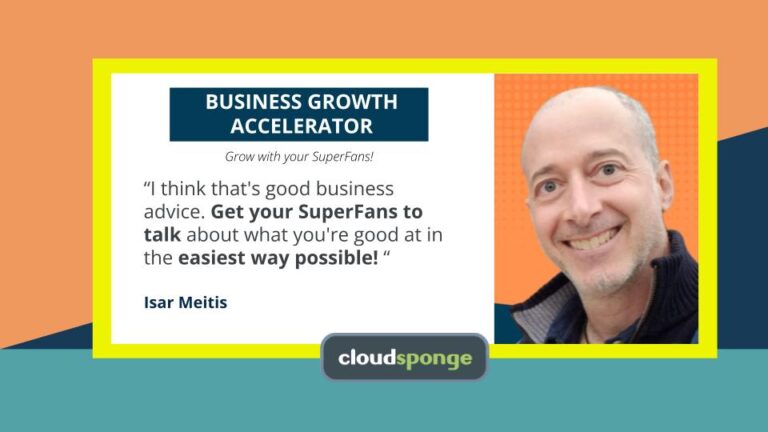
The CloudSponge Contact Picker is an extremely useful widget that e-commerce stores can easily integrate into their websites. The main objective of this tool is to greatly increase the number and accuracy of leads that website users enter into a typical “refer a friend” function on the site.
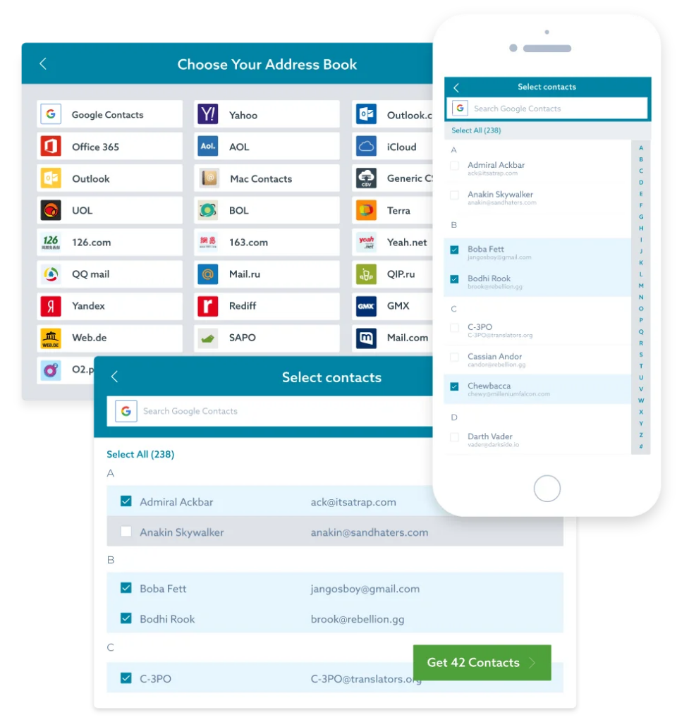
If your online store makes use of such a referral feature — one that incentivizes website visitors to share the contact details of their friends and family — you’re faced with two significant concerns. The first is the accuracy of the information provided. The second is the number of contacts entered.
The CloudSponge Contact Picker solves both of these concerns in an elegant, user-friendly way. By integrating with the user’s various online address books and allowing them to simply select and import the people they want to refer, you’ll be virtually eliminating both of these lead-generation obstacles.
5. Customer Retention Rate
We’ve already mentioned customer loyalty as one of the prerequisites of running a successful e-commerce business. But did you know that you could use UI design to boost your brand’s customer retention rate?
That’s right. Something as simple as making your support team’s availability highly visible can help you reassure potential and existing customers that you’re there whenever they need you. This is particularly crucial, considering that the quality of customer care you provide directly impacts your audience’s buying behavior.
Of course, this doesn’t mean that having a live chat feature on your website is enough to set you apart as a brand dedicated to next-level customer experience.
In fact, the Deloitte Customer Service Excellence report for 2022 revealed that 82% of consumers like to contact brands via email, 80% prefer calls, and less than 40% are willing to seek assistance via self-service, chat, social media, SMS, mobile apps, or video calls.
So, as you explore UI elements that will help you provide your users with better service, keep in mind who your target audience is.
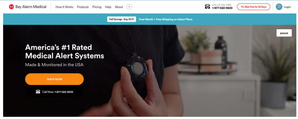
A quick look at the Bay Alarm Medical homepage shows that this e-commerce brand understands its core audience consists of older users who prefer phone communication and that some of its clients might need to get in touch quickly due to an emergency. This is why the telephone number is so prominent on the website. Moreover, it’s why the brand advertises that the call is toll-free: to remind its customers that it’s there whenever they need assistance.
6. Time on Page
Another performance indicator you should keep an eye on — especially if you want to engage web visitors and boost their chances of converting — is time on page.
As always, there are several ways you can ensure that the high-value pages on your e-commerce website hold your audience’s attention.
One would be to optimize your content for search intent so that web visitors can easily find what they’re looking for. Another is to share genuinely helpful information that proves your brand’s credibility. You could also shorten page load times and optimize for smaller screens, seeing that the majority of people access the internet by using mobile phones.
However, if you’re looking for UI design tips that will boost this e-commerce metric, the best thing you can do is focus on readability. By making your website more accessible, you can:
- Help web visitors easily identify information relevant to their shopping experience.
- Prevent potential customers from becoming frustrated or overwhelmed by having to read huge blocks of text.
- Improve comprehension and information retention by avoiding jargon and using visuals.
- Encourage people to read through high-value content, giving them a higher chance of discovering a benefit that could encourage them to convert.
- Improve website accessibility by choosing the right font and text size so that all web visitors have a great user experience.
To see an excellent example of a brand that prioritizes readability, check out the Kuru Footwear Plantar Fasciitis Shoes page.
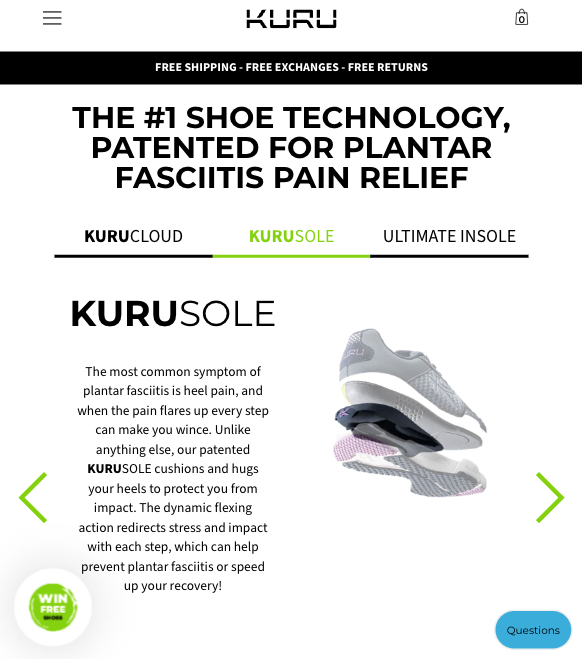
Kuru uses a few genius UI and UX design tricks to make the highly technical information engaging and easier to understand.
The first of these tricks is applying the right formatting techniques (like using a legible font, bolding key concepts, and keeping lines short). In addition to this strategy, KURU also ensures its visuals work together with the text, using sliders and illustrations to show precisely how its products benefit its target customers.
Wrapping Up
There you have it, some of the best UI design strategies you can use to boost critical e-commerce metrics.
As you can see, the majority of these KPIs are easily improved by making small UX and UI design changes.
However, if you have the budget to make more significant web usability changes — like developing interactive or personalization elements — don’t hesitate to take on the cost. In the end, creating a great website experience might be expensive. But it’s more than worth the investment. Especially if you’re looking to build a brand that’ll stay relevant (and profitable) for years or decades to come.
Want to improve your site's sharing performance?
Get the Better Sharing workbook now
(it's quick, easy and absolutely free!)