It’s no secret that a fundraising success largely depends on people other than the organization behind the project.
Friends and family, for example. And we’ve already talked about different ways to get them involved.
But any other website visitor can play a huge part in getting a project funded.
And that’s regardless of whether they supported the initiative financially or not.
How, by telling their network about it – sharing it on social media, email and through a multitude of other channels.
In fact, one online fundraising platform, Razoo, makes this clear to every website visitor. When leaving their site, users see the following exit popup:
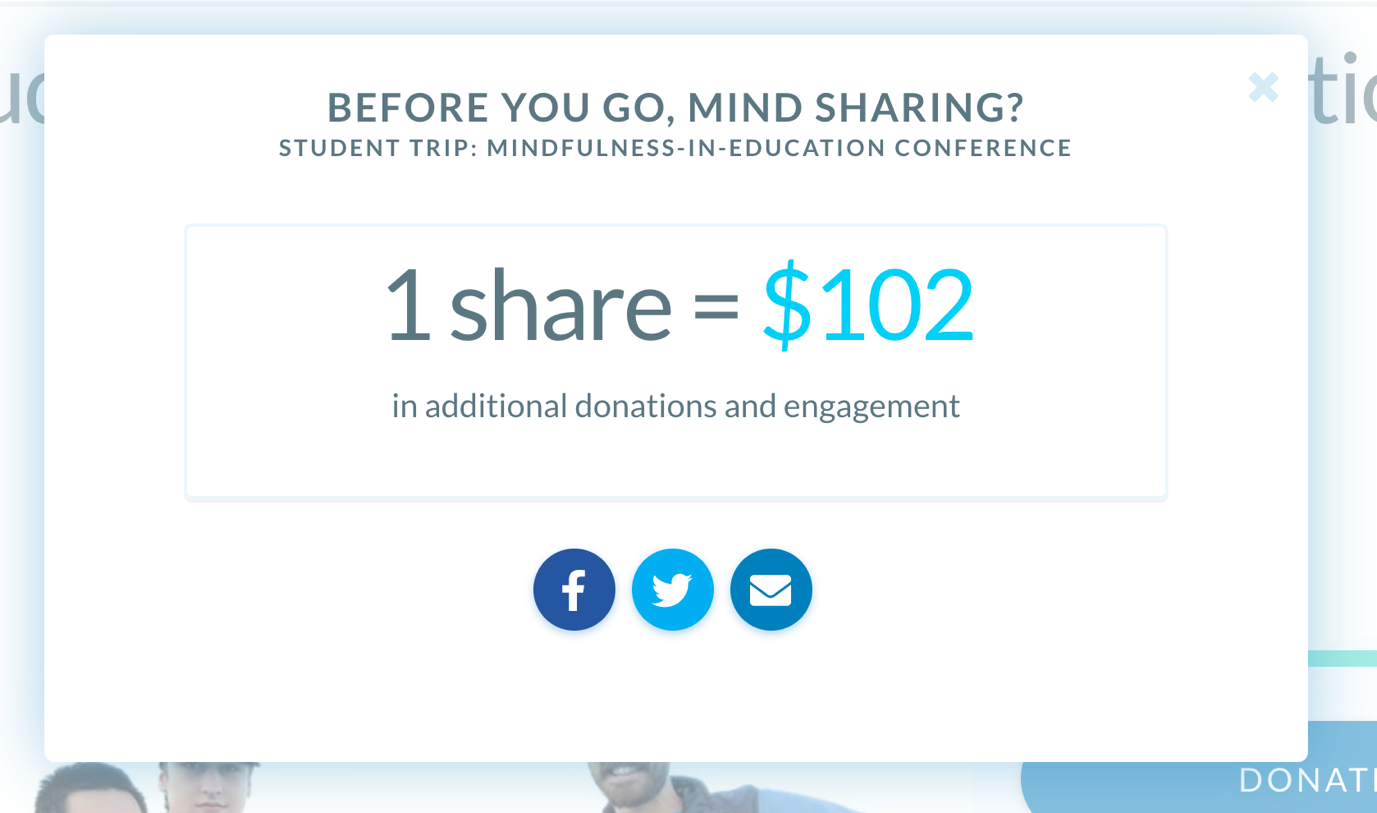
The catch? It’s your job to entice them to share and ensure that the process is easy to follow.
Luckily, that’s what I’m going to help you achieve in this post. We’ll discuss 4 usability strategies to boost fundraising initiative’s sharing.
Intrigued? Then let’s get started.
[Want to find out how other fundraising platforms boost their growth? Read DonorsChoose.org story here.]
Why Usability Can Make or Break Your User’s Project Success
Fact: Design, layout or visuals affect a person’s willingness to engage with your website as much as its content.
For example, according to Adobe, 38% of visitors will leave the site if they find its layout unattractive.
Plus, they can make that decision pretty quickly. Research by Google discovered that it takes visitors 1/20th of a second to judge a website’s design and make up their minds about it.
That’s 0.05 of a second!
But getting past that stage means no more than that a person is willing to give your page another look. However, they’re still far from even considering sharing it any further.
For one, they might not even know that you offer such option!
And if your UX is terrible, they might never discover it.
Just consider this. Users typically spend no more than a minute on a page. And given that this data comes from a study conducted in 2011, I think we can safely assume that it’s half of that time now.
And so, if they don’t discover (even subconsciously) your sharing options within 30-60 seconds… you’re toast.
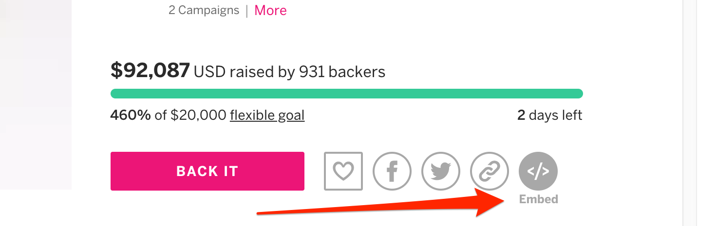
The problem? Those sharing buttons can be darn hard to find. Just consider this page from Kickstarter:
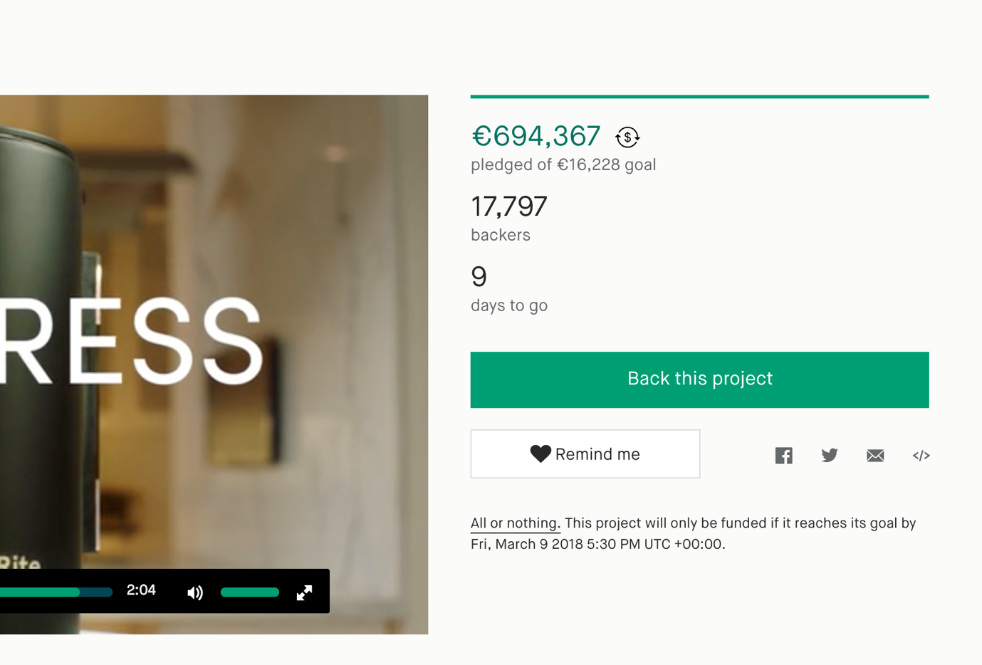
I bet even though you only looked at its fraction, you still didn’t notice sharing options right away, eh?
Now imagine how obvious would they be if you saw the full page? Would you spot them within half a minute?
Maybe. But also, the chances are you wouldn’t.
And so, here are 4 usability strategies to ensure your users don’t experience similar challenges with sharing.
#1. Group Sharing Buttons with Other Converting Elements
Have you ever wondered why exactly do we share information and experiences with others?
Because we’re happy? Sure, absolutely. After all, sharing positive experiences can boost our well-being.
But that’s not it. Sorry.
You see, 68% of us share to define ourselves to others. We do it to inform others of who we are and create an image or a persona.
We share information about causes we care about, content on topics that match the personality we want to convey, and so on.
The guys at Canva put it bluntly straight, saying (note, the emphasis in bold is mine):
“Between picture-perfect wedding photos, picturesque beach Instagrams, and iPhone shots of girls’ night, it sometimes seems like everyone has a perfect life – except for you. So, we carefully shape our own social media activity to match, sharing content that makes us seem funny, clever, or always well put-together.”
But judging this behavior aside, it’s something you could use to help entice more shares for your projects.
How, by positioning sharing options closer to elements that would affect people’s perception of themselves.
Which in case of fundraising means, backing a particular project that reflects a person’s image.
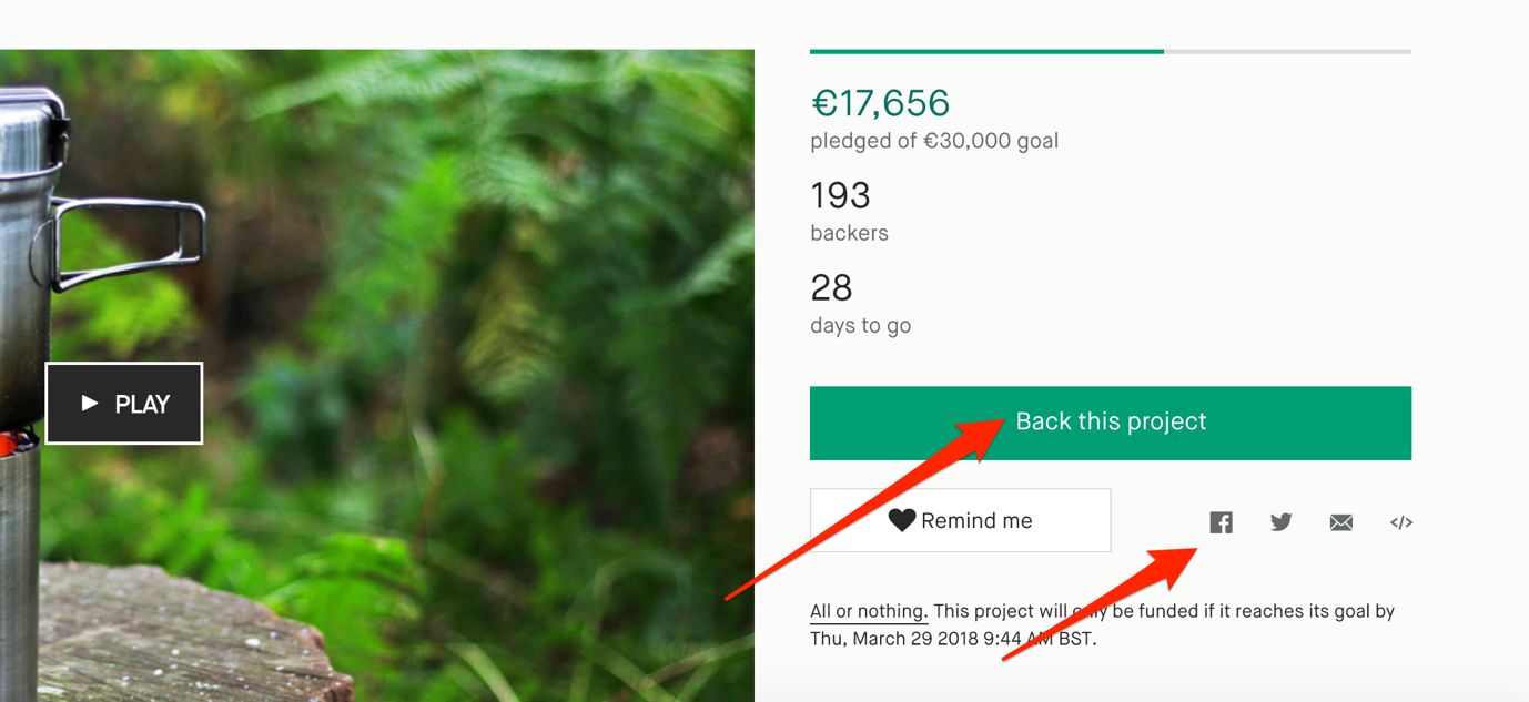
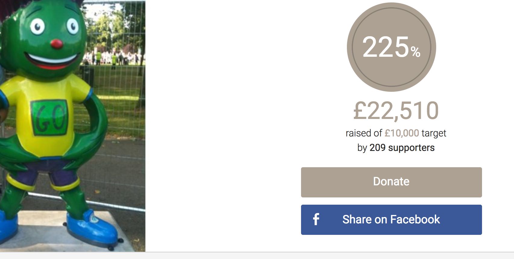
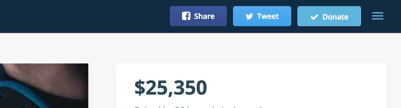
I know I used Kickstarter as a negative example above. However, I have to admit that at least they position their sharing options well, placing them right under the donation box:
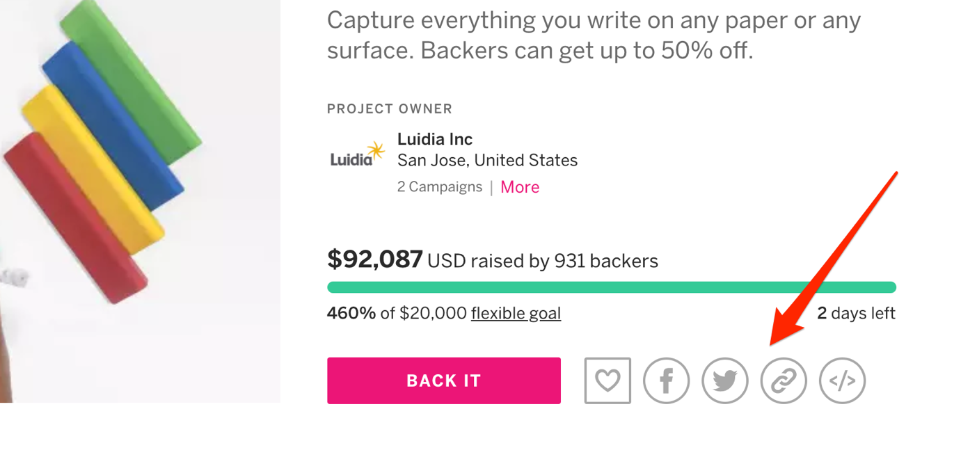
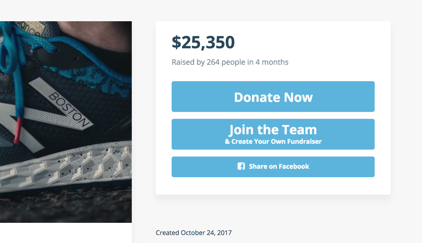
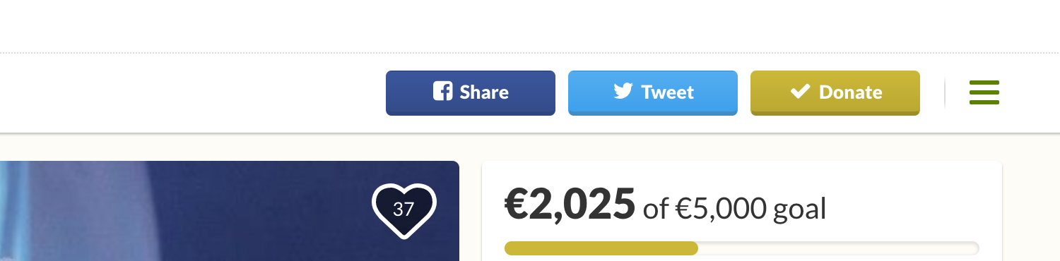
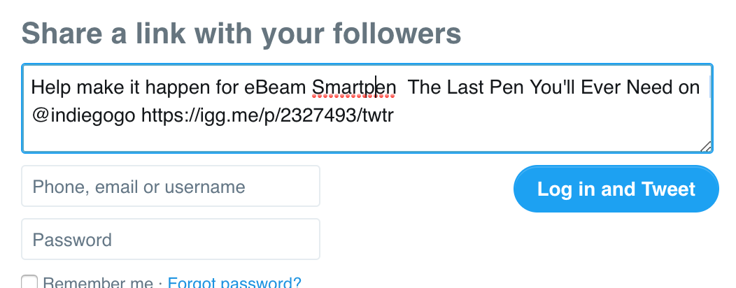
Indiegogo takes this further and puts both the backing button and sharing options together in one row.
GoFundMe uses a different approach – splitting sharing options between two locations. The menu on top features Facebook and Twitter, and they also place a separate Facebook sharing option right under the Donate button.
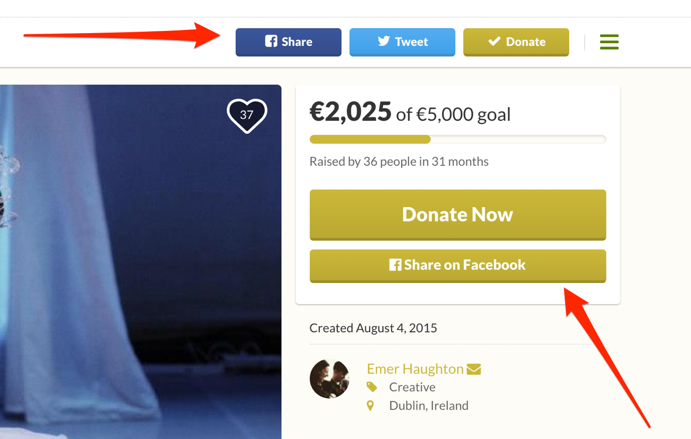
So does JustGiving:
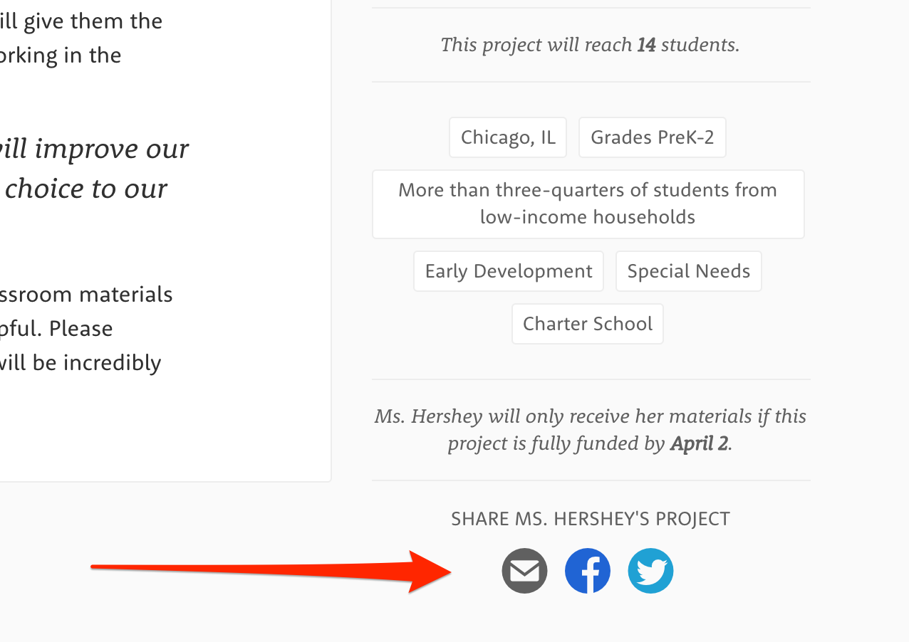
DonorsChoose.org, however, places their sharing options far from any other converting element – at the end of the sidebar, below additional project information like project tags, etc.
In doing so, they detach them from any elements that may affect a person emotionally.
#2. Add Contrast to Sharing Elements
Can you guess what’s the biggest obstacle preventing users from noticing sharing options?
(And I don’t mean poor placement here. There is something more.)
It’s the lack of contrast.
Many users will see elements that look the same as one and won’t distinguish any particular one. Even though, you’d so badly want them to.
And that simply because we no longer read pages, we scan them.
Contrast allows you to differentiate elements from each other, making it easier for a wandering eye to distinguish and recognize them.
Simply.
Crowdrise, for example, uses the same color for all three calls to action. Also, two of those use the same size. As a result, they rely on a person to identify the most important button for them.
Similarly, their top bar navigation also features buttons using a similar color scheme. Note that even the Donate button doesn’t stand out in any way.
GoFundMe, on the other hand, set each button in a distinct color, with the main call to action designed in line with their brand.
#3. Pre-set copy that takes the pressure away from the person to write it themselves
Getting a visitor to notice your calls to action is just half the battle.
Next, you need to help them actually to share projects.
And, when you think about it – one of the biggest challenges they may have is what to say in their message.
For example, would they know that adding an action verb might entice others to check out the project?
Or that providing an explanation why a project is important could have a similar effect?
I’d doubt it.
Solution – Write that copy for them.
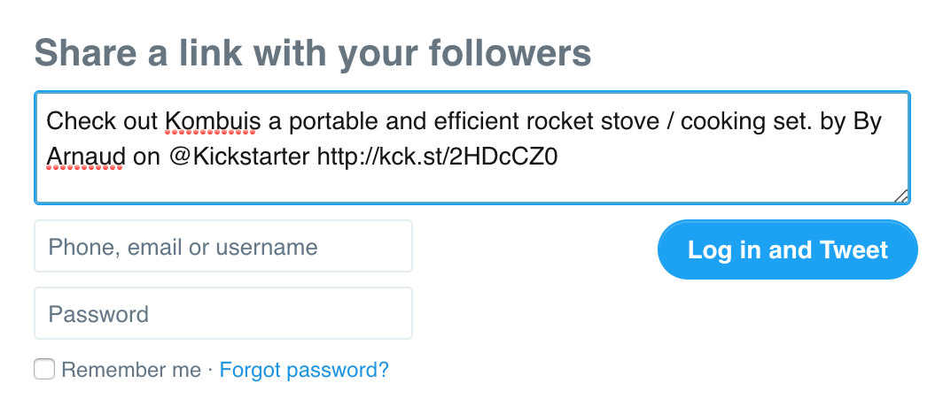
That’s what DonorsChoose.org does. Instead of simply including a project’s name in a tweet message, they offer custom and highly-engaging copy.
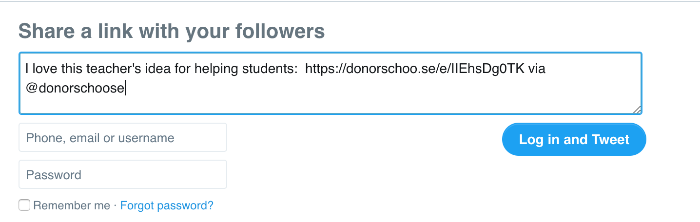
It’s no different if you click their email sharing button. They provide a compelling copy there too:
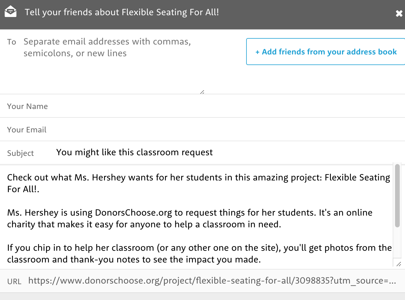
Match that with the ability to quickly import address books and send messages to all friends and family at a snap, and you’ll know how DonorsChoose.org boosted their email sharing by 65%.
Indiegogo focuses on the project. However, they do structure the message nonetheless:
So does Kickstarter:
However, for some reason, they don’t provide any custom email copy, including only the project’s name and its URL:
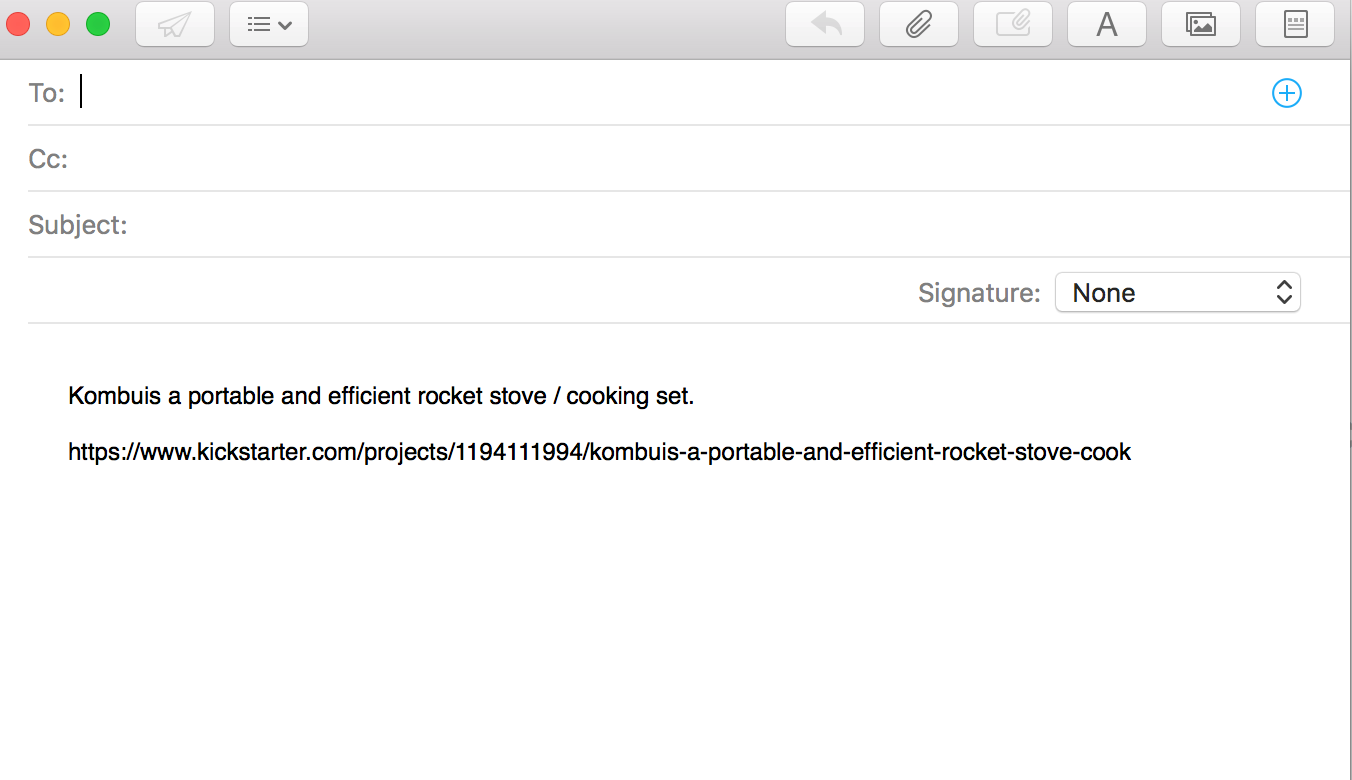
This looks like a missed opportunity, compared to the DonorsChoose.org email.
#4. Offer Instructions How to Share a Project
I admit, you and I, we know what a Twitter button should do, right?
We’re fully aware that clicking on a link icon will most likely generate a custom URL we could send to others.
But would all of your visitors know that too?
I guess it’s a safe bet to assume they’d be familiar with social sharing. But email, custom link, embedding… Now, these might still be a novelty to them.
And so, to overcome this friction, instill simple instructions to help them avail of those options.
Indiegogo, for example, uses labels in rollover state.
And DonorsChoose.org labels their sharing options together:
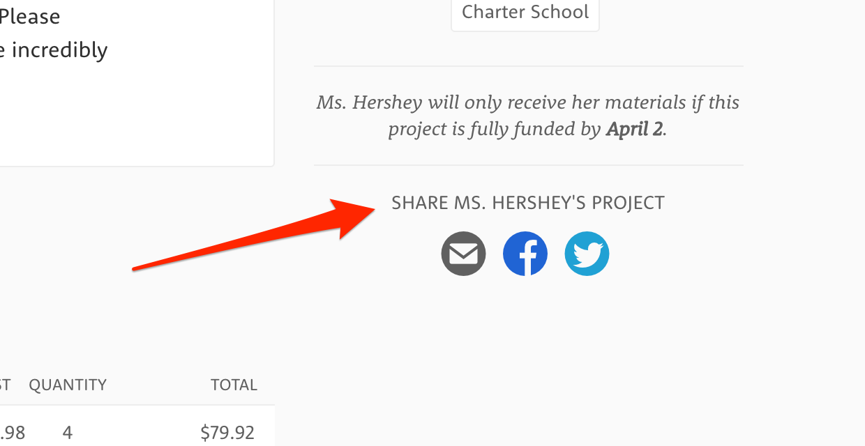
A simple touch but ensures that their visitors know exactly what to do if they decide to tell their network about a project.
Closing Thoughts
The success of any fundraising or crowdfunding project largely depends on other people telling their network about it.
But it’s your job to ensure that they can do so easily.
In this post, you’ve learned four usability strategies that help boost fundraising project’s sharing.
Improve your sharing features and get more sales today!
Download the Better Sharing Workbook Now
(it's quick, easy and absolutely free!)